Transform Your Website Into a Lead Generation Machine
Imagine walking up to a storefront only to find the windows dirty, the sign crooked, and the door jammed
Chances are, you’d turn away without a second thought.
Now, think about your website.
Is it turning potential clients away?
In the digital realm, slow load times, confusing navigation, and lackluster design are the equivalent of that unkempt storefront. At Kstudio Design, we specialize in turning your digital front door into an inviting path that leads straight to conversions.
Let’s explore how you can ensure your website welcomes every visitor with open arms and a clear path to engagement.
SECTION 1
Clear and Intuitive Navigation
A visitor’s journey through your website should be smooth and effortless. Just as a well-organized store guides customers to what they need, your website must have straightforward navigation that leads visitors to the information they're seeking without hassle or confusion.
Overcoming Common Mistakes
Overloading the navigation bar with every page link. Business owners often want to showcase everything they offer right at the top of their website, fearing that visitors might miss out on valuable offerings.
This approach can overwhelm visitors and make it difficult for them to find what they are looking for. Too many choices can lead to decision fatigue, reducing engagement.
How To Avoid This Mistake & Get Results
Prioritize based on your primary business goals. Structure your navigation menu to highlight the most important pages that align with your conversion goals. Less is more—focus on guiding visitors to take action rather than just browse.
Section 2
Compelling Calls-to-Action (CTAs)
Effective CTAs are like friendly staff members who ask “Can I help you?”
They guide your visitors on what to do next.
Whether it’s “Schedule a Call,” “Get a Free Quote,” or “Download Our Free Guide,” your CTAs should be clear, prominent, and enticing, encouraging visitors to take the next step.
Vague or overly passive CTAs, such as 'Learn More' or 'Click Here', that don’t evoke a sense of urgency or value.
If your CTA doesn’t clearly state what the visitor will gain by taking action, they’re less likely to proceed. Weak CTAs fail to motivate visitors, leading to lost conversion opportunities.
Common Mistake
Vague or overly passive CTAs, such as 'Learn More' or 'Click Here', that don’t evoke a sense of urgency or value.
If your CTA doesn’t clearly state what the visitor will gain by taking action, they’re less likely to proceed. Weak CTAs fail to motivate visitors, leading to lost conversion opportunities.
How To Avoid This Mistake & Get Results
Use strong, action-oriented verbs with a clear value proposition. For instance, “Download Your Free Guide to Doubling Sales” is more compelling and specific than “Click Here.”
Section 2
Speed and Performance Optimization
A slow-loading website is like a jammed door: it stops visitors before they even enter. Sites that load quickly provide a seamless entry for visitors, reducing frustration and bounce rates. Ensuring your website loads in two seconds or less is crucial for maintaining visitor interest and satisfaction.
Common Mistake
Neglecting website speed and performance optimization. Many business owners overlook this, focusing more on aesthetics than functionality. Slow-loading websites lead to high bounce rates as modern users have little patience for delays. This not only impacts user experience but also affects your SEO rankings.
Effective Strategy
Regularly test and optimize your website’s loading speed. Compress images, minimize HTTP requests, and use caching to enhance performance. Keeping your website fast is crucial for keeping visitors engaged.
Section 4
Mobile Responsiveness
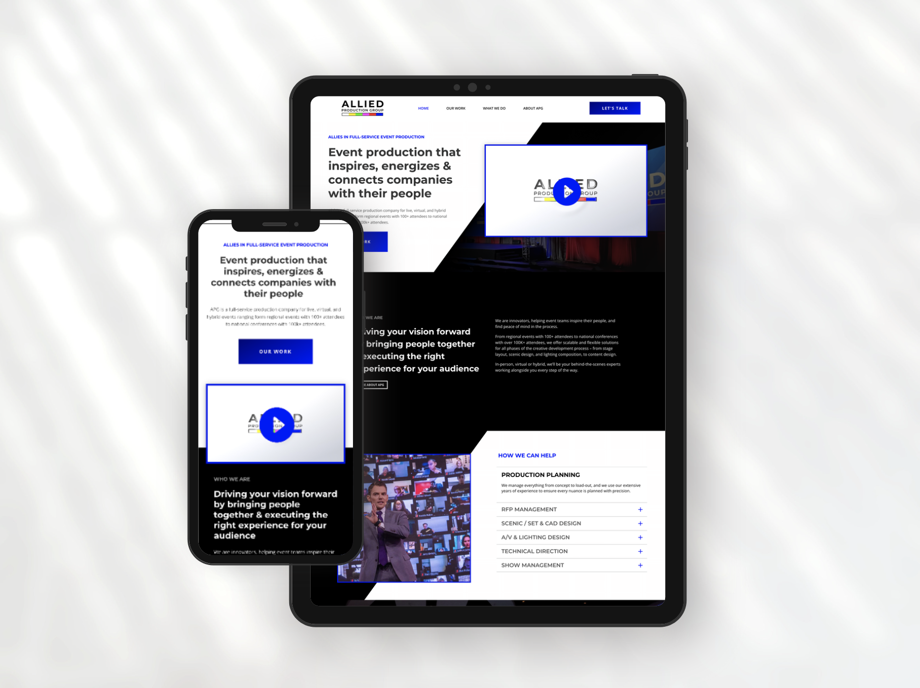
Today’s consumers are on the move, and more than half of all web traffic comes from mobile devices. A mobile-responsive website adjusts seamlessly to any screen, offering a consistent and engaging experience no matter how your visitors access your site.
Common Mistake
Designing a website primarily for desktop viewing and treating mobile compatibility as an afterthought.
With a majority of users accessing the internet via mobile devices, a non-responsive website provides a poor user experience, likely causing frustration and disengagement.
Effective Strategy
Adopt a mobile-first design philosophy. Ensure that your website is fully functional and visually appealing on smartphones and tablets. This approach not only improves user experience but also boosts SEO.
Leveraging Consistent Branding to Enhance Trust
Your brand is your promise to your customer. Ensure your website consistently reflects your brand's values, aesthetics, and messaging. This creates a cohesive experience that builds trust and encourages engagement.
How We Can Help?
Book a Consultation Today!
Don't let potential leads slip through your fingers. At Kstudio Design, we specialize in creating websites that not only attract visitors but convert them into loyal customers. Ready to revamp your online presence? Book a free consultation with us and turn your website into an effective lead generation machine.
Conclusion:
Your Website, the Ultimate Conversion Tool
A well-designed website acts as your hardest working salesperson: always on, always engaging, and always ready to convert visitors into customers. Partner with Kstudio Design to ensure your site is optimized not just for visits, but for conversions. Let’s make your digital presence a robust engine for business growth!
Schedule a call with our expert team today, and let's embark on this journey to online success together.


